

Sample product
What a Flowpoint website audit report looks like
The plates below are from a real sample scan of our own website. The walkthrough after that is illustrative of patterns we commonly find on local service sites, not a client report.
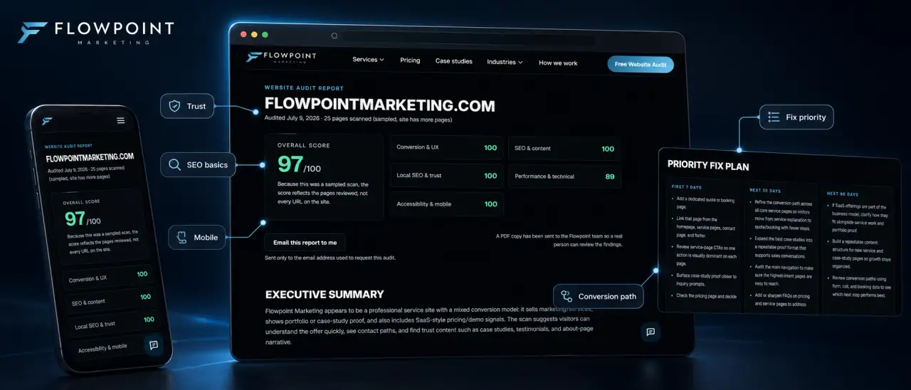
Sample report for our own website. Scores and findings are from our own site, not a client.
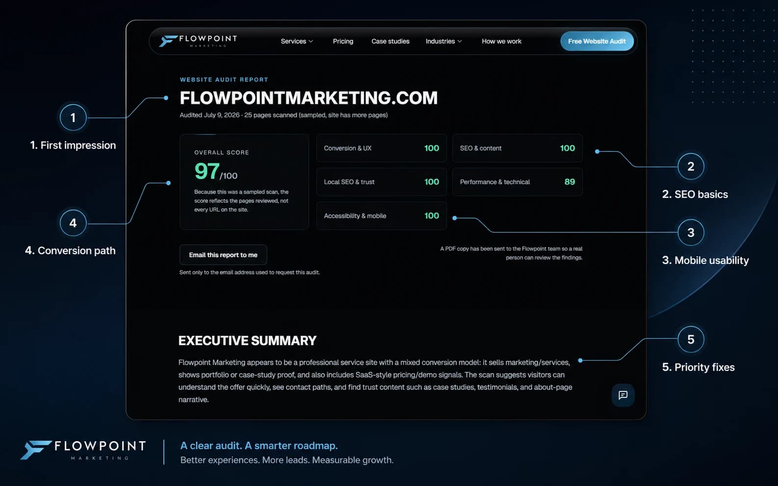
Sample callouts 1-5: first impression, SEO basics, mobile usability, conversion path, and priority fixes.
Scores, evidence, and what to fix first
The report opens with a score summary, then findings tied to pages we actually crawled. Callouts highlight first impression, SEO basics, mobile usability, conversion path, and a prioritized fix list, the same structure you get when you run the free audit.
View your report online or download the PDF. Contact us if you would like help with the fixes.
Readable on phone or desktop
Most owners open the report on a phone between jobs. The layout is built for that, not a 40-page PDF dump.
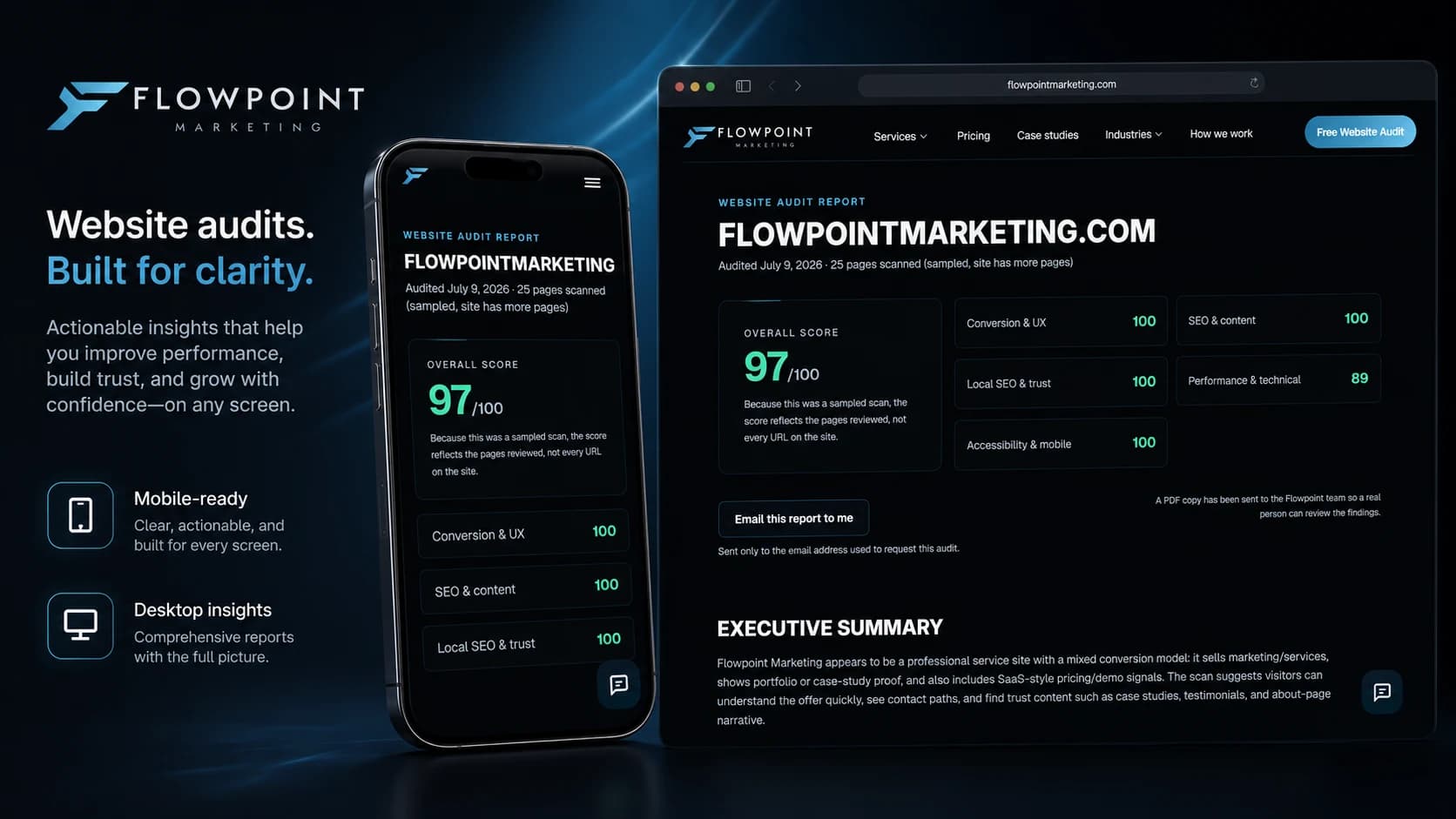
Browser report you can read on phone or desktop, plus a PDF copy.
Illustrative walkthrough
Patterns we commonly flag on local service sites
These findings are composite examples, not scores from the plates above. Your report is built from your public pages.
Speed and Core Web Vitals
High priority- Homepage loads in 4.2 seconds on mobile (target: under 2.5 seconds).
- Largest Contentful Paint blocked by an unoptimized hero image (2.8 MB).
- No image compression or modern formats (WebP/AVIF) in use.
- Render-blocking CSS and JavaScript delaying first paint.
Mobile experience
High priority- Primary CTA button is below the fold on most phone screens.
- Navigation menu requires two taps to reach service pages.
- Text size on service cards drops below readable threshold at 375px width.
- Tap targets on footer links are smaller than the recommended 44×44px minimum.
Clarity and CTA path
Medium priority- Homepage headline does not mention the primary service or location served.
- Three competing CTAs above the fold with no clear hierarchy.
- Contact page form has 11 fields. Review which details are needed for the first inquiry.
- No visible phone number on mobile service pages.
Local visibility and GBP alignment
Medium priority- Google Business Profile lists 'General Contractor' but site says 'Home Remodeling.'
- Service-area pages use identical copy with only the city name swapped.
- No structured data (LocalBusiness schema) on any page.
- Hours on site footer do not match Google Business Profile hours.
Follow-up path
High priority- Form submissions go to a shared inbox with no assigned owner.
- No confirmation message or next-step guidance after form submit.
- No automated reply or acknowledgment email to the submitter.
- Average first-response time not tracked or visible to the team.
Your report includes a prioritized fix list
Every finding is backed by evidence from your actual pages. You get a scored report and a PDF copy, whether you fix things yourself, with us, or both.
See what your site should fix first
The plates above are a real sample of our report. The walkthrough is illustrative. Your audit is built from your actual pages.